HongKong Amsterdam
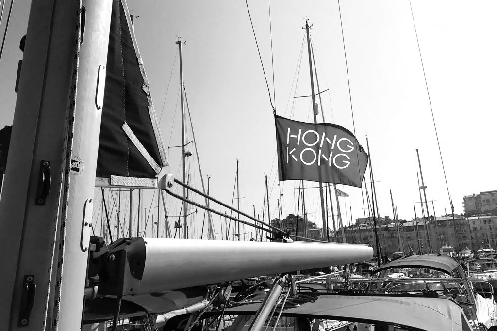
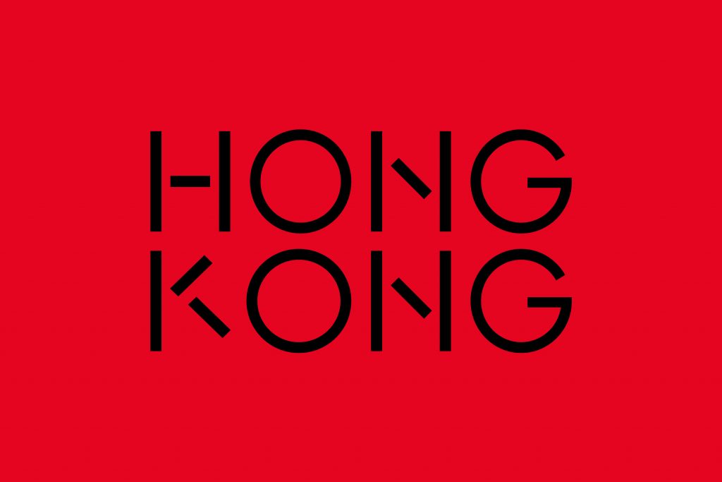
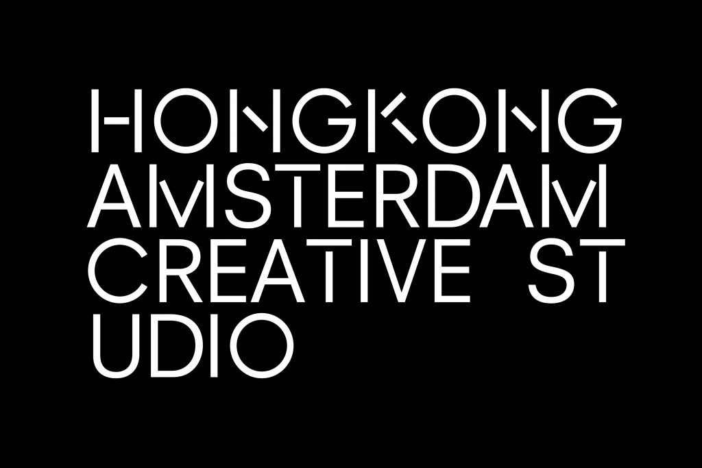
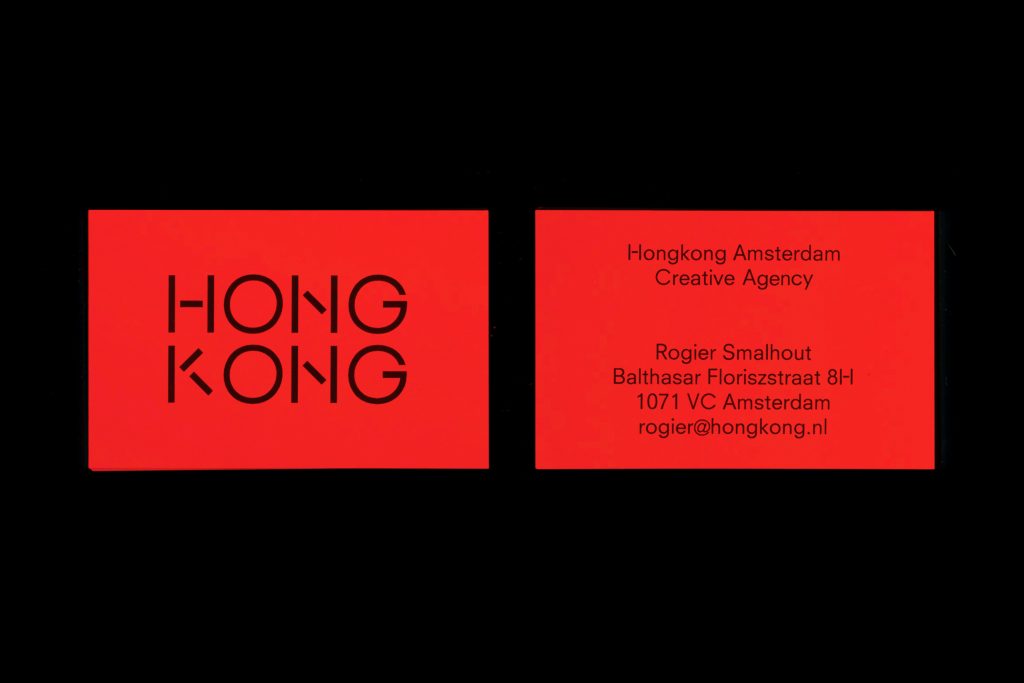
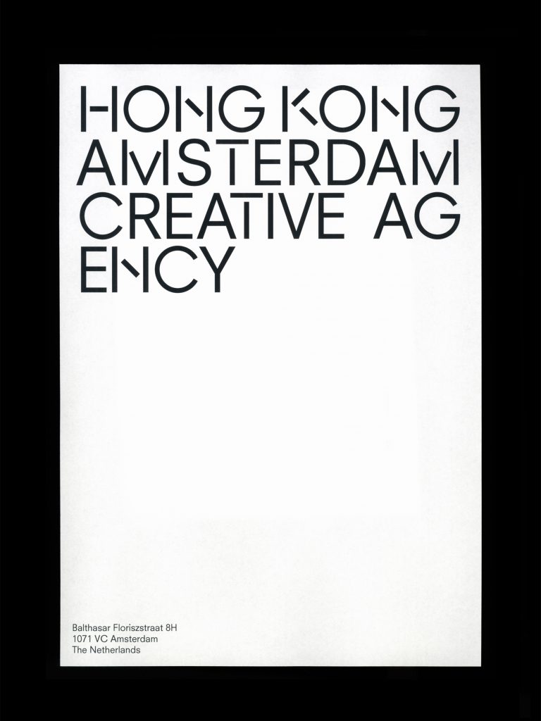
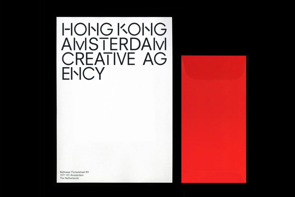
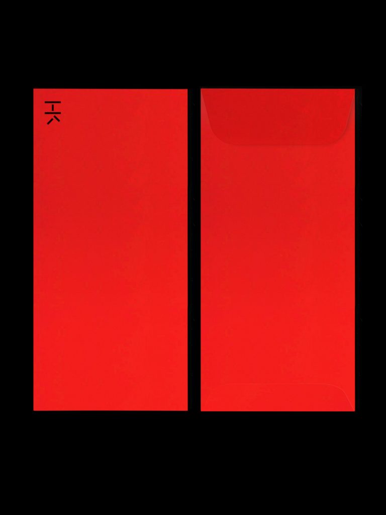
Anne & Rogier are lovely people: fun to hang round with and fun to work with too. When, for a brief moment, they decided to materialize their work ethic into a company and call it Hong Kong Amsterdam (pun intended), a small functional identity was in place. And of course it became a logical combination between neon signs, Chinese characters and Dutch modernism.
Hong Kong Amsterdam
2016
Graphic design
